Image courtesy of Scryfall.com
Decades of MTG Art Styles Across Time
If you’ve been collecting since the early days of Magic: The Gathering, you’ve watched the visual language of the game evolve in tandem with technology, global tastes, and the ever-shifting boundaries of fantasy illustration. From the scratchy, painterly charm of the 1990s to the ultra-polished cyberpunk vibes of Kamigawa: Neon Dynasty, MTG art has always told a story as loud as the card text itself. The journey isn’t just about pretty pictures; it’s a cineplex of eras you can hold in your hand 🧙♂️🔥. Each decade brought its own appetite for color, texture, and storytelling, and formats like foil, border design, and frame changes gave collectors a tactile timeline of the game's evolving identity.
1990s: Handful of Lines, Grand Fantasies
- Artwork leaned into traditional fantasy illustration—oil-like textures, bold heraldry, and characters that read like vivid legends. The battles were epic, the landscapes sweeping, and the magic often felt like a reenactment in oils and inks.
- Color palettes favored jewel tones and earth tones in cinematic contrast, with background details that rewarded close inspection under a tabletop lamp.
- Mechanics and flavor text often played with big, aspirational imagery—dragons, wizards, and sprawling kingdoms that invited you to write stories in your head as you drew cards from the deck.
2000s: Digital Brushstrokes Begin
- The arrival of digital painting introduced sharper edges, cleaner lighting, and broader, more polished textures. The art grew more luminous, with glowing effects that hinted at a cross between classic fantasy and digital experimentation.
- Set design started leaning into specific worlds with clearer silhouettes, making iconic creatures pop on crowded boards. The painterly warmth remained, but the lines felt modern, almost cinematic.
- Collectors began to notice how submission styles—spin-offs, alt arts, and frame tweaks—became a playground for artists to push the envelope while honoring the game’s genealogies.
2010s: Cinematics, Craft, and Craftiness
- Art direction shifted toward high-detail realism with dramatic lighting and storytelling clarity. It was the era of “painted photography,” where designers balanced narrative punch with card-readability on a crowded board.
- Frame and border conventions standardized into beloved rituals—the subtle shift of borders, the rise of full-art variants, and a broader willingness to experiment with texture, gloss, and depth.
- Flavor achieved a new synergy with mechanics: the visuals began to hint at the card’s strategic tempo, offering hints about speed, control, and the inevitability of a big play.
2020s: Neon, Narrative, and Global Influences
- Kamigawa: Neon Dynasty stands as a defining waypoint: neon-lit streets, cyberpunk motifs, and an homage to traditional Japanese aesthetics woven into futuristic cyberflow. The art travels beyond “fantasy” into a mood—one that feels like a city you could blueprint with a mana curve.
- Color and texture swing toward glow effects, reflective surfaces, and layered composition that rewards long looks under different lights. Cards invite you to study not just what you can cast, but what the world around the spell looks like when the plan actually unfolds.
- Artists like Ryan Pancoast push the boundaries within a respectable frame of readability, ensuring the card still plays well in a hurry while delivering a striking image that sticks in memory.
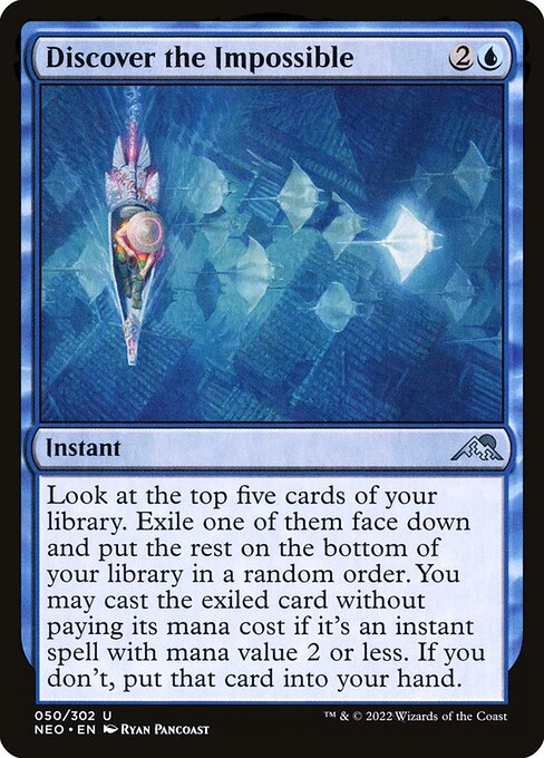
Take a moment to look at a blue instant from Neon Dynasty. The card Discover the Impossible, a humble uncommon, carries the blue archetype’s love for options—the mind’s eye can wander the top of your library and imagine a cascade of possibilities. Its mana cost of {2}{U} signals tempo and choice, with a text that asks players to weigh exile, random order, and the chance to cast a favorable instant for free. The artwork does more than decorate the card—it communicates the vibe of a world where neon dreams meet the ancient, almost mythic, energies that MTG has always cherished 🧙♂️💎.
Art is the time capsule of a set’s mood—the way a figure’s gaze or a city’s glow whispers about what's possible when you tap that mana and flip the top five. The best pieces don’t just decorate a card; they invite a second or third narrative to emerge at the table 🎨.
The Kamigawa: Neon Dynasty frame—framed in black with a 2015-style presentation—feels like a bridge between the beloved old-school compositions and a modern, high-resolution dreamscape. The card’s rarity—uncommon—hints at a design intent: accessible yet intriguing, a perfect spark to entice new players into a lot of nuanced discussions about deck-building and tempo control. The artist, Ryan Pancoast, delivers crisp lines and luminous highlights that make the spell feel almost electric on the table, a nod to the neon motif that saturates the Neo set. You can sense the street-level energy in the image, with color and glow guiding your eye toward the key components of the card’s effect 🔥⚔️.
For players who love a good budget pick that still looks like a centerpiece, Discover the Impossible is a prime example of how contemporary art styles can harmonize with classic blue magic. Its ability to let you explore the top five cards, exile one face down, and potentially cast an instant for free—if it fits the mana value—offers a delicious puzzle. The art’s urban neon palette echoes the decision points you face when you’re balancing tempo, card advantage, and bluffing in a matchup. The aesthetic tells you, in color and composition, that modern MTG isn’t afraid to mix retro fantasy with cyberpunk edge 💎🎲.
Collectors, Communities, and the Visual Feast
Art direction isn’t a behind-the-scenes afterthought; it’s a living conversation among players, artists, and collectors. TheKamigawa Neon Dynasty era is beloved for its willingness to explore cross-cultural influences and futuristic reinterpretations of bygone legends. As you map decades of MTG art, you can track how each set becomes a chapter in a larger story—each frame a pronunciation of the game’s evolving identity. The uncommon rarity of Discover the Impossible doesn’t keep it from standing out; it anchors a moment when blue-themed cleverness meets bold neon aesthetics, a combination that turns casual glimpses into deep, ongoing conversations about card design and narrative arc 🔮🎨.
And because we’re all collectors at heart, it’s worth noting the practical side: even as you admire the artwork, you’ll notice the card’s market presence—modest price points that invite new players to dip their toes into the Neo pool without breaking the bank. It’s a reminder that great art can be accessible, and that the value of a card isn’t just monetary but the memories it helps create across a table of friends and rivals alike.
If you’re exploring these art trends and want to keep a tangible piece of the Neon Dynasty aesthetic nearby, consider not just collecting cards, but also carrying a little neon-magic with you. The Neon Card Holder + MagSafe Phone Case offered by Digital Vault fuses practical gear with the same visual energy we celebrate in MTG art—a small way to celebrate a hobby that’s as much about storytelling as it is about wins and losses 🧙♂️💎.