Image courtesy of Scryfall.com
Depth as Drama: A Look at the Everybody Lives! Artwork
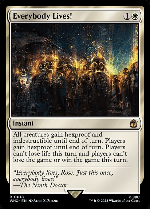
Magic: The Gathering has always been a masterclass in slipping narrative into a single frame, and the Everybody Lives! piece from the Doctor Who crossover era is a particularly vivid study in perspective. Painted by Alice Xia Zhang for the Who set, the artwork invites us to peer through multiple planes at once—foreground details anchoring the moment, midground figures hinting at motion, and a soft, almost cinematic background that stretches into a timeless ether. The result is a composition that feels not just like a snapshot of a single moment, but like a doorway through which a story can travel. 🧙♂️🔥
The piece leans into classic perspective cues—overlapping forms, graduated contrast, and careful alignment of lines that guide the eye toward a central, almost breath-held moment. White mana, the color identity of this card, often signifies purity, defense, and clarity. In the artwork, that white light seems to act as a solvent, thinning the space between elements just enough to suggest depth without sacrificing legibility. It’s as if the image wants you to lean in, to notice the careful layering of shapes, the way a glint on a shield catches the eye, and how a figure’s silhouette recedes just a touch into the distance—an invitation to linger a beat longer. ⚔️🎨
On a design level, the card’s instant-speed protection—hexproof and indestructible until end of turn—mirrors the visual effect of depth: layers that temporarily shield what lies behind, creating a sense of space that contracts and expands with the turn. The flavor of “Everybody Lives,” spoken by the Ninth Doctor (as captured in the flavor text), aligns with the composition’s mood of relief threaded through tension. The moment feels like a pause in time, where the immediate threat is muffled by a broader, more generous horizon. This is depth as narrative tempo, a reminder that perspective isn’t just about distance, but about where we choose to place our attention. 🧙♂️💎
“Everybody lives, Rose. Just this once, everybody lives!”
That line isn’t just about the character moment; it’s a lens into how the art negotiates risk and relief. The viewer’s eye is drawn to the strongest contrasts in the foreground—the crisp edges, the brighter whites—while the background dissolves with a softer rim of light, creating a palpable sense of depth. It’s a nod to cinematic composition: open space invites interpretation, while the sharper, protected foreground anchors the viewer in a concrete moment. This balance between clarity and atmosphere is one reason the card remains visually compelling whether you’re leafing through a binder or scrolling a deck list. 🎲
From a collector’s perspective, the artwork’s depth translates into a strong read of the card’s emotional stakes. The Doctor Who crossover’s rarity (rare) and the artist’s distinctive style contribute to a memorable visual identity that stands out in both foil and nonfoil iterations. The card’s printed history—in a Commander set, with a 2023 release window and a frame that nods to both classic and contemporary design—further enriches its shelf presence. For players who prize not just function but atmosphere, Everybody Lives! offers a compact lesson in how depth can be engineered in a single frame: layer, light, and a confident focal line that makes the story feel urgent and personal. 🔥
Strategically, the white instant’s impact—granting hexproof and indestructible to all creatures, and hexproof to players, while stalling life loss and game-ending outcomes for the turn—parallels the artwork’s deliberate pacing. The deck’s tempo shifts on a dime: protection becomes a shield for vulnerability, depth becomes a shield for tempo, and storytelling becomes a shield for mood. The result is a moment you feel in your hands as you resolve the spell, a moment the art invites you to re-live as you study the piece from every angle. That’s depth in action—both on the battlefield and in the frame. 🧙♂️🧭
For readers who crave tangibility beyond the gallery of digital images, the card’s aura of reverent nostalgia is complemented by its real-world value. With a current price hovering around $8.79 USD for the standard version and a noticeable uptick for foil copies, Everybody Lives! sits at a niche intersection of pop culture reverie and collectible MTG artifact. The artwork’s balance of harsh light and softened edge, plus the iconic flavor cue, makes it a memorable centerpiece for any Doctor Who-themed collection or a broader white-leaning tempo deck. The depth is part mood, part mechanism, and part memory—an invitation to revisit a moment when the universe’s boundaries felt malleable and the story could bend toward hope. ⚔️💎
If you’re looking to carry a little of that MTG magic into everyday life, consider pairing your tabletop enthusiasm with practical, stylish gear. The Slim Lexan Phone Case for iPhone 16 — Glossy Ultra-Slim is a clean companion for fans who want technology and storytelling to travel together. It’s a product that embodies a similar ethos: slim, sturdy, and designed to protect precious ideas and devices without getting in the way of the moment. And yes, a little MTG flair never hurts when you’re between bus stops, drafting lines of text, or scheming deck strategies on the go. 🧙♂️🎲
If you’re curious to explore more about how depth informs design across digital and physical goods, here are five engaging reads from our network that riff on systems, scarcity, and style:
More from our network
- https://crypto-acolytes.xyz/blog/post/understanding-crypto-bridges-how-cross-chain-transfers-work/
- https://crypto-acolytes.xyz/blog/post/the-real-cost-of-crafting-high-level-gear/
- https://crypto-acolytes.xyz/blog/post/code-driven-digital-scarcity-creating-real-value/
- https://blog.digital-vault.xyz/blog/post/designing-clean-minimal-digital-planner-dashboards/
- https://crypto-acolytes.xyz/blog/post/mismatch-between-photometric-teff-and-spectroscopic-teff-in-a-blue-giant/
To keep the conversation rolling, dive into the product link below and add a touch of MTG-inspired flair to your everyday carry. The cross-promotional fit is deliberate but subtle: it’s about celebrating that same blend of art, strategy, and storytelling that makes both the card and the accessory feel like a complete experience.