Image courtesy of Scryfall.com
Visual Composition and Art Direction: Festival of Trokin
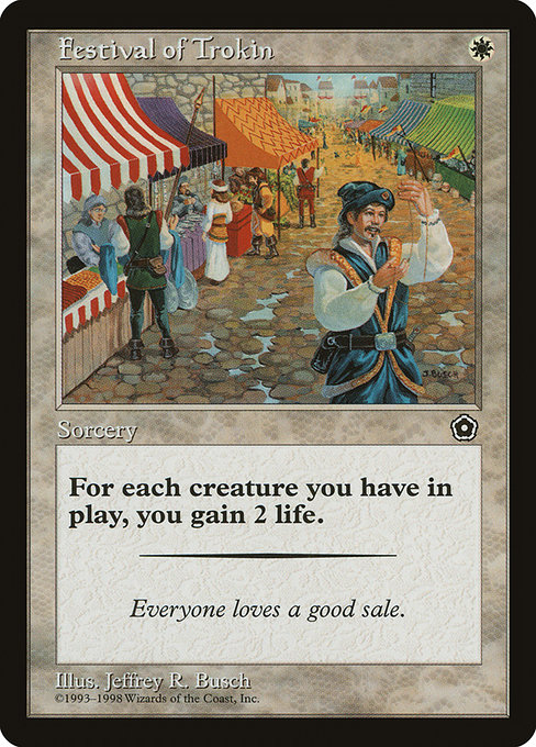
If there’s a card that embodies the Portal Second Age’s approachable charm, Festival of Trokin stands tall on the pedestal of simplicity meeting whimsy 🧙♂️. The art direction leans into clarity and cheer, a hallmark of the early starter sets that invited new players to dip their toes into the mana pool without feeling overwhelmed. The composition uses clean silhouettes and a bright, almost editorial glow to convey a moment of communal celebration. It’s not about epic scale or brooding drama; it’s about a moment of collective spark—where allies gather, banners flutter, and a single white spark of magic quietly shifts the balance of a life total. The result is art that feels both accessible and nostalgic, a friendly invitation to pick up a spell and a new deck-building idea 🔥🎨.
Color, Light, and Layout
- Color discipline: White mana rules the palette with calm neutrals and warm accents, a contrast that underscores life-gain as a strategic beacon.
- Light as a guide: The artwork often uses a bright, hopeful light that draws the eye toward the central action without clutter. This makes the card instantly legible from a distance—a crucial trait for a starter-set piece.
- Balance and negative space: The composition offers breathing room around the core motif, letting the viewer feel the “festival” atmosphere without getting overwhelmed by ornamentation or busy details.
- Silhouette clarity: In an era when many cards leaned on crisp outlines, Festival of Trokin embraces bold silhouettes that translate well on both basic paper and later digital formats.
Lore, Flavor, and the Tiny Moment that Feels Grand
Flavor text—“Everyone loves a good sale.”—adds a playful wink to the scene, reinforcing a sense of community and generosity that white strategies often chase in game terms. That line isn’t just a joke; it hints at a cultural moment in Magic where the exchange of favors and the surge of life totals go hand in hand. This card, anchored by its single-mana cost, embodies a design philosophy in which practical effects can still resonate emotionally. It’s a reminder that even the humblest spell can tilt the battlefield when measured in smiles and a few well-timed lifelines 🧙♂️.
Artist, Set, and Era: A Window into Portal Second Age
Jeffrey R. Busch lends a clean, accessible style that fits Portal’s mission: teach players to read the board, understand timing, and feel a sense of progress with each spell. The frame and printing details—1997-era black border, normal layout, common rarity—signal a period when Magic explored approachable fantasy in a compact package. The Portal Second Age set (p02) was designed as a starter experience, and the art direction reflects that ethos: friendly, legible, and aspirational rather than cryptic or overly dense. This piece sits comfortably among other early lifegain moments, offering a visual cue that healing and celebration can coexist on a single, well-placed card ⚔️💎.
Gameplay Fragments: How Visuals Inform Strategy
Beyond the pretty picture, Festival of Trokin offers a straightforward engine: you gain 2 life for each creature you control. That’s a flexible trigger in many white-centered strategies—from swarm- or token-based boards to more conservative life-gain shells. In practice, the card rewards players for building a modest board presence, encouraging decisions that balance tempo with defense. Visual cues in the art—crowds of celebrants, banners catching the light—mirror the gameplay tempo you want: a quick swing in life total that signals a turning point. In older formats where this card circulated, its lifegain upside was a subtle but meaningful incentive to keep your creatures alive and your board presence intact 🧙♂️🎲.
Collectibility, Access, and Value Snapshot
As a common in Portal Second Age, Festival of Trokin sits on the approachable end of the spectrum for collectors. The card’s nonfoil, reprint status, and the era’s printing quirks contribute to its charm as a nostalgia piece. Scryfall’s price snapshot places it around a dollar in USD and half a euro—modest by any standard, but with a surprising voice in the right nostalgia-driven trade. For players who savor the tactile joy of early Magic, this is a perfect pick-up for a budding lifegain deck or a friendly nod to the game’s history. The card’s presence in formats like Legacy, Vintage, and Commander (as indicated by its legalities) means it remains a talking point for long-tail discussions around how lifegain mechanics evolved across the years 📈🧙♂️.
Inspiration for Designers and Collectors Alike
From a design perspective, the card is a case study in how a minimal effect—two life per creature—can inform broader deck-building decisions without demanding complexity. The art direction provides a template for how to frame a single idea within a shared visual language: clarity first, charm second, and a dash of ambition to spark curiosity. For collectors, Festival of Trokin is a small but potent reminder of Magic’s aging yet evergreen charm—the way a well-crafted image and a tightly scoped mechanic can still resonate decades later. It’s not just a card; it’s a memory trigger that brings back the tactile joy of shuffling decks, trading cards at a kitchen table, and whispering “one more game?” as the players circle back to the battlefield ⚔️🎨.
From Page to Practice: A Playful Cross-Promo
If you’re a fan who loves the craft of card presentation as much as the game itself, you might enjoy treating your daily carry with care. The same spirit of design that makes Festival of Trokin feel approachable also translates into how we carry and protect our gear on the go. For fans who want to blend MTG vibe with everyday utility, a neon clear silicone phone case can be a perfect companion—slim, protective, and just a touch radiant for the conventions, game nights, or casual play at the local shop. It’s the little touch that keeps your gear as memorable as your favorite drop 💎🔥.
As you explore the history of Portal Second Age and its charming lifegain moments, you’ll notice how visual language and mechanical simplicity work in tandem to invite new players into the story. Festival of Trokin is not the flashiest card in the toolbox, but it embodies a philosophy: make the moment of healing feel communal, make the art breathe with light, and remind us that every creature on the battlefield contributes to the bigger celebration.