Image courtesy of TCGdex.net
A Look at Kommo-o GX: Japanese vs English Card Layouts
For players and collectors, the difference between Japanese and English Pokémon TCG layouts is more than a matter of aesthetics—it's a window into how information is presented under pressure. Kommo-o GX, a rare Dragon-type powerhouse from the SM Black Star Promos line illustrated by 5ban Graphics, serves as a perfect case study. While the card itself remains readable and impactful in any language, the layout choices in JP and EN printings influence readability, timing, and even how you prioritize your strategy during a game.
The card at a glance
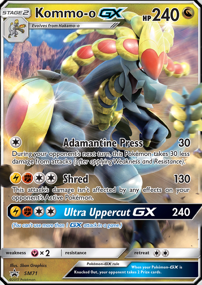
Kommo-o GX is a formidable 240 HP Dragon-type Pokémon that evolves from Hakamo-o. It appears in the SM Black Star Promos set, a promo line known for high-impact artwork and distinctive holo variants. The card features three attacks: Adamantine Press (Colorless for 30 damage with a protective twist: your opponent’s Pokémon take 30 less damage on their next turn after weaknesses and resistances are applied), Shred (Fighting + Lightning + Colorless + Colorless for a solid 130 damage with a ruthless caveat—its damage is immune to effects on the opponent’s Active Pokémon), and the devastating Ultra Uppercut GX (Fighting + Lightning + Colorless + Colorless for 240 damage, with the GX restriction that you can’t use more than one GX attack per game). The card carries a Fairy-type weakness at ×2 and a modest Retreat Cost of 2, making it a heavy finisher that also needs careful positioning on the bench. The illustration by 5ban Graphics shimmers across holo variants, giving collectors a premium visual to chase in both JP and EN printings.
From a design perspective, Kommo-o GX sits at a crucial intersection where language and layout meet strategy. The EN and JP versions carry the same core data—the name, HP, evolution line, energy costs, and attack text—yet the way that data is laid out can alter how quickly a reader registers key details during play. The card’s rarity and holo treatment are also part of the collector conversation, as promo lines like SM Black Star Promos often emphasize unique finishes that differ from mainstream sets.
Layout differences that affect gameplay perception
- Name and type placement: English cards tend to emphasize the Pokémon name and HP in bold, with the type line neatly aligned adjacent to the artwork. Japanese layouts historically balance the text box with tighter typography and slightly different line breaks, which can alter how many lines of ability text are visible at a glance.
- Attack language and spacing: In EN printings, attack names and effect text can wrap differently due to font choices and translation length. The same Kommo-o GX attack texts—Adamantine Press, Shred, and Ultra Uppercut GX—are translated for JP, but line wrapping may yield a more compact or more extended text box in JP vs EN. This impacts how quickly a player can parse the effects during a tense moment.
- Energy costs and iconography: The energy costs for each attack use the same palette of symbols, but the surrounding typography and alignment can shift. In JP cards, the energy icons might sit closer to the attack name, with tighter spacing, which affects readability when you’re juggling several attacks in a turn.
- Illustrator, set symbol, and rarity indicators: The data panel includes the illustrator credit (here, 5ban Graphics), the set symbol for SM Black Star Promos, and the rarity label. While the information is identical in both languages, the relative positioning of the set symbol and rarity star can differ slightly between JP and EN printings, subtly influencing the card’s overall balance on the tabletop.
- Text box wrap and translation impact: Because the JP text often uses more compact phrasing and sometimes different kanji/hiragana choices, the line count in the ability text can vary. This means a single English and Japanese print of Kommo-o GX might look slightly taller or shorter, affecting how you orient the card among your other tools during a match.
One notable practical takeaway for players is to practice reading the JP print just as you would the EN version. Both carry the same rules around the GX attack, which explicitly restricts usage to one GX attack per game. It’s a reminder that even with identical mechanical text, the layout quirks of each language edition can shape how cleanly you extract the information under pressure—especially when you’re gauging whether a counter GX move is the right tempo play in the heat of a battle.
“Layout choices shape the moment-to-moment flow of a game. A slightly tighter text box or a different line wrap can change how quickly you see a crucial effect, which matters in high-stakes turns.”
Strategic implications for collectors and players
Kommo-o GX is an archetype of dual-purpose power: the early-game setup with Adamantine Press’s damage mitigation, the mid-game value of Shred’s clean 130 damage, and the game-ending punch of Ultra Uppercut GX. In English printings, the spacing around the attacks and the readability of the effect text can influence how you map your bench and anticipate counters. In Japanese printings, the tighter typography and potential line-wrapping differences may affect how quickly you spot an essential clause in Adamantine Press or the GX restriction on Ultra Uppercut GX.
From a collector’s perspective, the SM Black Star Promos line—particularly holo variants—holds strong appeal. Kommo-o GX’s 240 HP indicates a durable frontline presence, and its evolution from Hakamo-o situates it firmly within the mid-to-late-game swing. The rarity and holo status add to its prestige, regardless of language edition, while the artwork by 5ban Graphics anchors its visual memorability. For players, this card rewards a build that can weather a few hits, keep the energy flowing for Shred, and time Ultra Uppercut GX to threaten a knockout with a well-chosen bench setup.
Programming the play: a practical guide
To maximize Kommo-o GX’s potential in a deck that respects the language differences in printings:
- Energy management: Prepare a mix of Fighting and Lightning energy to meet Shred’s cost, while keeping Colorless energy available for the bulk of Kommo-o’s toolkit. The more you can align your energy stream with attack costs, the fewer moments you’ll waste on energy-hunting during critical turns.
- Defensive timing: Adamantine Press is your shield. Use it proactively to cushion against opponent’s big swings, setting up a safe window for Shred and Ultra Uppercut GX to land later in the game.
- GX attack sequencing: Remember the GX rule—one GX attack per game. Reserve Ultra Uppercut GX for a pivotal moment when you can break a stalled board or clinch a decisive knockout, rather than early gambits that could leave you without your strongest option later.
Whether you’re chasing a polished JP print or a dazzling EN version, Kommo-o GX demonstrates how language and layout interplay can shape your experience of a card. The combination of high HP, a versatile attack suite, and a striking illustration makes it a standout example for fans who savour both the mechanical depth of the TCG and the artful storytelling that accompanies every promo release.
Custom Neoprene Mouse Pad - Round or Rectangular, Non-SlipMore from our network
- https://transparent-paper.shop/blog/post/creating-realistic-dust-and-scratches-in-post-production/
- https://blog.digital-vault.xyz/blog/post/hateful-eidolon-unpacking-its-planes-culture-and-ethos/
- https://blog.digital-vault.xyz/blog/post/chaos-and-coin-flips-farbog-revenant-in-un-set-mechanics/
- https://blog.digital-vault.xyz/blog/post/canopy-dragon-mastering-board-control-with-repeating-triggers/
- https://blog.digital-vault.xyz/blog/post/breath-of-fury-regional-price-disparities-and-collector-behavior/