Image courtesy of Scryfall.com
Design secrets from a Vanguard staple: Oracle and the craft of MTG card design
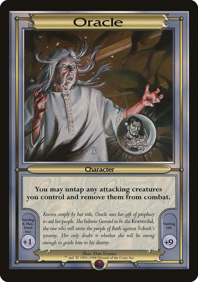
If you’ve ever marvelled at the delicate balance of a card that feels both simple and transformative, you’ve likely spent time thinking about how a designer threads a single line of text into a grand tapestry. The Vanguard card known as Oracle offers a perfect case study. Released in the late 1990s within the Vanguard Series, this rare, oversized card arrives with no mana cost and a deceptively lean ability: “{0}: Untap target attacking creature you control and remove it from combat.” That small line exists at a confluence of tempo, protection, and meta-narrative—an MTG design sweet spot that still resonates for builders today. 🧙♂️🔥💎⚔️
From a high-level perspective, the decision to give a Vanguard card zero mana is a bold one. In a game where resource management is king, removing the mana cost from an interaction invites players to think about timing, combat puzzles, and multi-player dynamics rather than pure speed. The effect itself is a powerful tempo tool: you can save a key attacker from the brink of damage, reframe a combat math problem, or simply buy a window to regroup. The lesson for modern designers is clear—occasionally, less cost, more consequence, and a well-timed twist can define a card as memorable for decades. 🧙♂️
Flavor and world-building arrive hand in glove with mechanics in this design. The flavor text anchors Oracle within a mythic tapestry—she is “Known simply by her title,” a prophet guiding Gerrard toward a destiny against tyranny. That line does more than lore-dress the card; it gives players a mental model for how to use the ability. When a card earns a place in a saga, its power tends to echo the story’s need: here, a poised, decisive intervention that preserves the long arc of a plan rather than a single flashy play. Builders can learn to couple a crisp mechanical hook with a flavor-driven rationale that invites players to imagine strategic futures beyond the current board state. 🎨
Colorless identity, colorful design constraints
Oracle’s lack of color and its Vanguard framing speak to a broader design discipline: identity can be conveyed through function and context as strongly as through mana symbols and color wheels. The card’s colorless nature does not render it bland; instead, it emphasizes the role of position, timing, and control in a multiplayer environment. For designers, this reinforces a core idea: you don’t need punchy colors to carry a strong concept; you need a clear design lane and a memorable moment when that lane is hit exactly as the game wants it to unfold. The Vanguard set, with its oversized format and distinctive rulings, further nudges designers to think about audience-facing cues—how a card reads from a distance, how its text interacts with other Vanguard rules, and how a single line of text can alter multiple players’ plans in a single swing of the table. 🔮
From prototype to print: rarity, presentation, and print decisions
Oracle lands as a rare, with an aura of print-era mystique that includes Dan Frazier’s artwork and a 1993 frame style. The art and typography choices matter as much as the words themselves because, in older designs, the visual language communicates a lot about the card’s intent before a player even reads the ability. Vanguard cards were print-forward experiments in how players would engage in broader, more narrative-driven play. The oversized treatment and promo-style presentation lent Oracle a sense of occasion—an artifact card that feels like it belongs to a special moment in a saga rather than a routine duel. For designers today, the takeaway is to consider how format, print treatment, and scarcity shape a card’s perceived weight and longevity. ⚔️
There’s also a practical design angle tied to balance. The ability’s costless activation can become a “do-anything-now” button unless carefully counseled by surrounding rules text and game state. Vanguard cards, by their nature, nudge players toward a different balance curve: one where life totals, hand sizes, and board states can drift between games and sessions. This invites designers to study how micro-interactions—like untapping a creature and removing it from combat—play with macro- balance across a multiplayer environment. The design secret is that a seemingly small effect can ripple into big strategic space when framed within a distinct format. 🧩
Art, lore, and the lasting resonance
Dan Frazier’s illustration style on Oracle helps foreground the prophetic authority the card embodies. The visual cue of a figure who holds sway over a battlefield—while remaining enigmatic—parallels the flavor text’s sense of fate and leadership. When drafting a card meant to feel legendary in scope, a designer can borrow this approach: craft a succinct ability that hints at a larger narrative, then lean into evocative artwork and flavor to invite players to imagine the broader stakes. The synergy between text, art, and lore is a powerful tool in any design brief, and Oracle stands as a reminder that the most enduring cards often weave all three strands into a single, coherent thread. 🧙♂️🎨
For builders today, the Oracle blueprint offers an actionable checklist:
- Ask: What single engineered moment should define this card? Aim for a compact effect that enables clever play rather than brute force.
- Pair mechanic with flavor: Let the lore illuminate when and why the ability should matter in a given contest.
- Consider format context: How will card interactions shift in a special format or in multiplayer dynamics?
- Balance the cost and reward: A zero-cost effect must be carefully tethered to risk or strategic depth.
- Value the presentation: Art, frame, and rarity influence how players remember and talk about the card.
As designers and fans, we can borrow confidence from those early Vanguard iterations—trust a sharp, lean line of text; honor a rich world with a matching vibe; and let format context do a lot of the heavy lifting in balance. And since MTG is as much about community as it is about cards, consider how such design choices radiate outward, inspiring talk, theorycraft, and even a fresh wave of custom or casual tabletop setups. If you’re planning your next battle station or stream-ready desk setup, a reliable mouse pad can be a quiet but meaningful companion to a night of ladder climbing and lore-writing. 🧙♂️🎲
Speaking of desks and strategies, you might want to level up your physical setup with a sleek accessory that keeps pace with long sessions and quick reactions. The Gaming Mouse Pad 9x7 Custom Neoprene with Stitched Edges offers a reliable surface—perfect for precise clicks and smooth cursor movement as you map out counterplays and plan tempo plays in your own open-table sagas. Check it out via the product link below and keep your boardroom, kitchen table, or gaming nook both comfy and sharp.
Gaming Mouse Pad 9x7 Custom Neoprene with Stitched Edges
More from our network
- https://crypto-acolytes.xyz/blog/post/unlocking-secrets-of-medieval-castles-in-open-world-games/
- https://blog.digital-vault.xyz/blog/post/steel-wall-shared-laughs-sustaining-mtg-communities/
- https://blog.digital-vault.xyz/blog/post/moonsnare-prototype-controlling-the-board-state-through-its-effect/
- https://transparent-paper.shop/blog/post/effortless-workbook-templates-for-online-coaches/
- https://crypto-acolytes.xyz/blog/post/golden-era-arcade-cabinets-a-nostalgia-revival/