Image courtesy of TCGdex.net
Art Across Borders: Phione and the Regional Printings Phenomenon
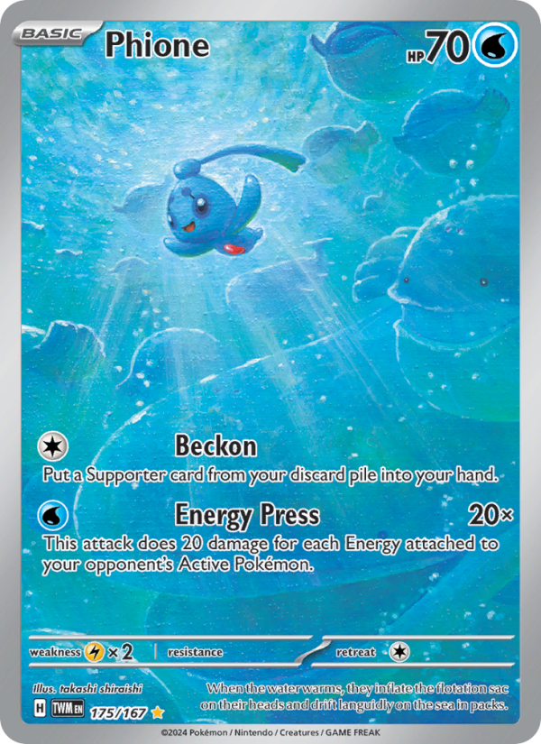
In the Pokémon TCG, regional printings are more than just language translations; they are windows into how artists, printers, and collectors perceive a card across continents. Phione from the Twilight Masquerade era offers a fascinating lens into these artistic differences. Though the mechanics and the core card text stay constant, each regional printing can deliver a subtly different visual experience—altering how fans connect with a familiar Pokémon. The Twilight Masquerade version of Phione, illustrated by Takashi Shiraishi, is a stellar example: a water-weave tableau that feels as fluid as the sea Phione calls home, yet carries nuances in polish and presentation that can be traced back to regional print runs and market expectations.
The artist’s imprint and the holo signature
Takashi Shiraishi’s art for Phione is a reminder that regional variants aren’t about erasing identity; they’re about presenting it through a particular lens. In Twilight Masquerade, Phione’s render glides across a cool, aqueous background, with soft lighting and delicate linework that evoke a gentle, buoyant mood. In some regions, the same artwork is reproduced with slightly different color saturation or holo foil orientation, a difference that may feel subtle in person but can be striking in a parapet of parallel prints. The holo pattern itself—a standard holographic finish in this release—retains its rainbow shimmer, yet the way that shimmer catches the light can vary by printer batch and language-specific production lines. Collectors often notice that a single holo glow can appear more electric in one region and more iridescent in another, a reminder that “region” in the TCG is as much about production nuance as it is about packaging words.
What regional printings commonly differ on—and what stays the same
- Typography and language: English, Japanese, and other languages fetch the same card data, but font choices and label placements can skew perceived balance. The rarity label “Illustration Rare” may appear in English in some printings and as a localized phrase in others, affecting how the card’s hierarchy reads at a glance.
- Set symbol and logo treatment: Twilight Masquerade’s emblem remains the same, but its size, placement, or surrounding border can shift slightly by region, subtly guiding the eye as you skim your binder.
- Holo pattern and foil alignment: The holo effect is a hallmark feature, yet the depth of the foil and its grazing lines can differ with region-specific printers and paper stocks. This is part of the charm for collectors who enjoy comparing shimmering patches under different lights.
- Card frame and border color: Even when the art is identical, frame tint and border finish can drift. A cooler blue wash in one market might appear warmer in another, shaping how the scene reads emotionally—calm seas in one print, a touch more contrast in another.
- Text box layout and set information: On some regional runs, the alignment of the attack text and the card’s flavor text can be nudged a few pixels, nudging the card’s rhythm when laid out in a deck or a binder spread.
While these differences are mostly cosmetic, they carry weight for the devoted collector. An art-focused binder page might showcase Phione’s serene waterscape as a focal point, while a pure gameplay binder might highlight its two attacks—Beckon and Energy Press—without drawing attention to the surrounding art. Either way, Phione’s basic nature remains intact: a Water type with 70 HP, ready to waterlog your strategy with its two practical moves.
Phione in Twilight Masquerade: gameplay and value in context
Phione’s two attacks tell a compact story about tempo and resource management. The Beckon attack, with a Colorless cost, allows you to fetch a Supporter card from your discard pile, effectively recycling utility exactly when you need it most. In a game where line-by-line optimization matters, Beckon can shape pivotal turns, letting you reclaim an answer to a stalled strategy or set up a finish by retrieving a critical Supporter card. The second attack, Energy Press, costs Water and delivers 20 damage for each Energy attached to your opponent’s Active Pokémon. That means a single-attached-energy setup on the foe can yield a quick, punishing sequence—an invitation to exploit even small openings when your board position aligns with a regional print run’s preferred balance of clarity and artful presentation.
The card’s rarity—Illustration Rare—coupled with its holo finish, adds an extra sheen to the collecting experience. For players, the card remains a legitimate, legal pick in both Standard and Expanded formats (regulationMark: H). In market terms, holo Phione from Twilight Masquerade shows a modest premium relative to non-holo peers in the same print cycle. On CardMarket, holo variants trend around a higher average than non-holo versions, with “avg-holo” hovering near €0.11 and a low around €0.02 in some listings. It’s a tiny market, but for a niche card with a repeatable, calming image, that premium is meaningful for collectors who chase the aesthetic as much as the mechanics.
From a collector’s vantage point, region-influenced art differences offer a layered thrill: you’re not just chasing a card you can play; you’re chasing a piece of a global art conversation. The Twilight Masquerade Phione—art by Shiraishi, printed in holo—acts as a bookmark in the broader narrative of how the Pokémon TCG travels with its fans. The water-themed palette fits Phione’s lore as a sea-dwelling Pokémon and invites a contemplative kind of collecting: a toast to the small, shimmering variances that regional printers preserve for a discerning audience ⚡💎.
For fans who want to engage with this card in person, examine a few practical tips: inspect holo alignment under a light, compare the subtle shifts in color saturation from region to region, and note any variance in the set symbol’s stamp. These tiny differences aren’t just trivia; they are a passport to the card’s journey through time and geography. And while the art is a constant anchor—the serene, watery portrait by Takashi Shiraishi—the regional printings add a layer of human-scale nuance that can make each copy feel bespoke to a collector’s personal history with the game. 🎴🎨
Phone Case with Card Holder MagSafe (Glossy or Matte Finish)More from our network
- https://blog.rusty-articles.xyz/blog/post/how-templating-shapes-deepfathom-skulker-understanding/
- https://blog.digital-vault.xyz/blog/post/how-to-write-clear-knowledge-base-articles-for-users/
- https://transparent-paper.shop/blog/post/digital-paper-elevates-fashion-lookbooks-for-magazines/
- https://crypto-acolytes.xyz/blog/post/namcos-arcade-rise-how-pac-man-shaped-the-golden-age/
- https://crypto-acolytes.xyz/blog/post/economics-of-modern-arcades-revenue-trends-and-play/