Image courtesy of Scryfall.com
Bridging Physical and Digital MTG Design: A Side Quest in Card Design
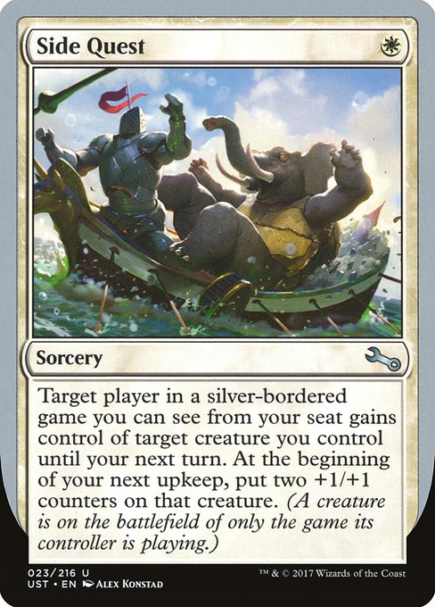
In the Magic: The Gathering ecosystem, the jump from cardboard to code isn’t just about shuffling a few frames of animation or translating flavor text into a tooltip. It’s about preserving the soul of a card while adapting its mechanics, readability, and humor to platforms that demand different faucets of attention. Side Quest, a white-mana sorcery from the Unstable set, offers a playful blueprint for how a compact, cheeky concept can scale from a table to a screen without losing its punch 🧙♂️🔥. The card’s design—{W} cost, uncommon rarity, and a two-part effect that lives as much in flavor as in function—provides a fertile ground for examining cross-platform adaptation, as well as the broader philosophy behind bridging physical and digital MTG design.
Side Quest costs a single white mana, a deliberate nudge toward quick, fringe-friendly play—perfect for a 1-mana coup in a universe that loves efficiency with a wink. In the physical world, its humor hinges on the paradox of control: you temporarily transfer ownership of a creature you control to an opponent in an Un-game you can observe from your seat. Then, at your next upkeep, that very same creature gets two +1/+1 counters. It’s a neat trick that relies on game-state memory and a shared laugh about the artificial rules of play. Translating that joke to a digital space means ensuring the interaction remains obvious, avoids cognitive bloat, and still delivers the punchline with timing and clarity. That’s where the design discipline shines: keeping the core interaction intact while leveraging interface and feedback mechanisms unique to digital platforms ⚔️🎨.
From a design perspective, the card’s oracle text foregrounds three core ideas that map surprisingly well to both realms. First, a conditional control mechanic anchored in a self-referential scenario—“target player in an Un-game you can see from your seat gains control of target creature you control until your next turn.” In physical play, this relies on seat position and shared context; digitally, it invites a clean UI that highlights “this creature” and “that player” with intuitive pointer cues and a compact timer that communicates the temporary nature of the ownership swap. Second, the two-turn buff—two +1/+1 counters at upkeep—creates a short but meaningful payoff that rewards players for tracking the state across turns. Digital translation can amplify this with subtle animations, but must avoid distracting from the core choice: which creature do you pass to the opponent, and when does it revert? Finally, the line “A creature is on the battlefield of only the game its controller is playing” lampoons the multiversal variety of MTG while gently reminding players that Un-set rules apply within their own meta-scope. That self-aware humor is precisely the sort of meta-layer that digital audiences crave when the physical community is already fluent in the joke 🧙♂️💎.
Design takeaways for cross-format consistency
- Clarity over cleverness: Side Quest’s effect is clever, but its timing and scope must be crystal on screen. Digital design benefits from concise wording presentation, with an on-screen summary of “gain control of your own creature until next turn; at upkeep, put two +1/+1 counters.”
- Contextual cues: In digital environments, add lightweight hints—tooltip or brief flavor pop with a no-surprise flag. The “Un-game you can see from your seat” is a humor cue that can be visually signposted to prevent misreadings across languages or screen sizes.
- Flow and timing: The stay-and-release dynamic benefits from a visible countdown or turn-tracking indicator. A quick, friendly nudge communicates that ownership changes are temporary, preserving the joke without requiring players to memorize obscure rulings.
- Art and flavor fidelity: The art by Alex Konstad anchors the card in Unstable’s chaotic whimsy. In digital formats, crisp art presentation and consistent border treatments help maintain recognition, even when users zoom or inspect card details on small devices.
- Accessibility and readability: A one-mana swing with a double-layer effect begs careful type size, contrast, and line breaks to ensure that new or color-impaired players can parse the text quickly during a busy game moment.
Beyond the mechanics, Side Quest invites a broader conversation about how designers and developers approach the same concept differently across physical and digital spaces. The physical card thrives on tactile feedback—the turn of a card, the light snap of the sleeves, the shared laughter around a quirky rule. Digital design, meanwhile, unlocks animated timing, subtle sound effects, and standardized tooltips that keep players in the loop without slowing down the game. The result is not a replacement for one medium, but a harmonization: the card’s essence remains, while its presentation adapts to the constraints and opportunities of the platform 🧙♂️🎲.
For collectors and designers alike, Side Quest is a reminder that MTG’s design language travels well when core intents—cost, color identity, tempo, and flavor—are preserved and augmented with platform-appropriate cues. In this instance, the color identity remains white, the mana cost stays lean, and the rarity nudges toward thoughtful deck-building moments rather than bombastic late-game plays. In a digital-first era, that translates into accessible tooltips, crisp imaging, and a UI that gracefully supports the card’s narrative arc without stealing the stage from the other quirky Un-set moments that populate the rest of the set 🔥⚔️.
As we continue to imagine cross-format adventures, marketers and curators alike can lean on the cross-pollination between physical nuance and digital finesse. The same design spirit that makes Side Quest work at a table—humor, clarity, and a clean arc of interaction—also informs how we present MTG content online, from card previews to product collaborations with tech-forward retailers. If your next project is to bridge a physical product with a digital experience, think about how the card’s rhythm translates: a small cost, a playful payoff, and a moment of shared discovery that resonates across screens and sleeves alike 🧙♂️💎.
Clear Silicone Phone Case: Slim Durable Open Port DesignMore from our network
- https://transparent-paper.shop/blog/post/designing-creative-journaling-dashboards-a-practical-guide/
- https://transparent-paper.shop/blog/post/turbocharge-digital-product-creation-with-ai/
- https://crypto-acolytes.xyz/blog/post/next-gen-voting-systems-for-solana-daos/
- https://blog.digital-vault.xyz/blog/post/how-brands-build-consistency-with-social-media-templates/
- https://crypto-acolytes.xyz/blog/post/former-congolese-president-faces-death-sentence-for-war-crimes/