Image courtesy of Scryfall.com
Typography and Layout: Reading The Fallen Apart through the lens of card design
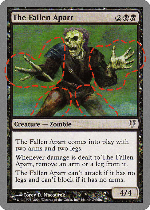
Magic: The Gathering has long been a study in visual storytelling as much as strategic play, and the typography and layout of a card can tell a story almost as loud as the art itself. When we tilt our gaze toward the Unhinged set, a zany, silver-bordered experiment from 2004, the typography steps into the foreground in delightfully deliberate ways. The Fallen Apart—a black-aligned zombie creature with a 4/4 profile and a knack for turning damage into a limb-counting meta-joke—demonstrates how layout choices carry humor, readability, and a dash of nostalgia all at once 🧙♂️🔥💎.
On the surface, The Fallen Apart looks like a standard creature card: name at the top, mana cost in the upper-right corner, a type line declaring “Creature — Zombie,” followed by the heart of the card—its rules text and its power/toughness. But Unhinged isn’t content with the baseline. The silver border itself signals somethingBefore- and after—an invitation to a lighter, more playful approach to card design. The card’s mana cost, {2}{B}{B}, sits neatly in the corner, establishing black’s characteristic gravity while hinting at a heavier, almost ritual-like payoff in the textual center. Its rarity is common, and the text is laid out in clear, legible blocks that players can parse aloud without stumbling over long line breaks—an essential feature when jokes hinge on timing and delivery 🎲.
Let’s zoom into the oracle text, which is where the layout truly sells the concept. The block is concise, but each sentence is a compact rhythm: This creature enters with two arms and two legs.
Whenever damage is dealt to this creature, remove an arm or a leg from it.
This creature can't attack if it has no legs and can't block if it has no arms. The typography respects rhythm. Each sentence begins with a capitalized, declarative cadence, then evolves into a precise mechanical consequence. The line breaks are not random; they serve a joke-first flow while preserving the card’s readability. The layout keeps the arm-and-leg motif visually legible, almost as if the text itself is counting the limbs as you read—an elegant interplay of content and presentation 🧠🎨.
“This creature enters with two arms and two legs. Whenever damage is dealt to this creature, remove an arm or a leg from it. This creature can't attack if it has no legs and can't block if it has no arms.”
From a typesetting perspective, The Fallen Apart uses a conventional font treatment for a funny card, which helps anchor the joke in familiar MTG syntax. The type line “Creature — Zombie” follows the expected cadence, while the body text sits below in a readable, compact block. The capitalization and punctuation are precise, ensuring that the humor lands without tripping over clumsy phrasing. The color identity remains pure Black, reinforcing the gloom and macabre whimsy that a zombie clan invites, even as the literal limb-removal mechanic keeps the laughter present in every line of play 🖤⚔️.
There’s also a design curiosity worth noting: the set frame and border. Unhinged cards feature a silver border in lieu of the traditional black one, signaling a break from the standard competitive environment. This border choice nudges players toward a casual, social experience—perfect for a card that leans into slapstick horror more than raw power. The Fallen Apart is printed as common and appears in both nonfoil and foil options, which means enthusiasts can chase a shiny rarity on a card whose value is as much about memory as it is about mana cost. The piece by Corey D. Macourek, paired with a playful illustration in the art_crop, invites collectors to savor the art as much as the effect on the battlefield. That synergy between art, text, and layout is where typography becomes a storytelling device rather than a mere vessel for rules 🧙♂️.
In practical terms, the card’s design encourages a certain kind of playstyle in casual formats. The limbs-as-resources mechanic invites players to think about risk and tempo in a whimsical way. It’s a reminder that in MTG’s broader ecosystem, gameplay can be a narrative experience as much as a contest of who holds the better curves of advantage. The readability of the sentence structure helps players anticipate what will happen when damage lands: limbs come off; the creature can’t attack or block when appropriate limbs are missing. It’s a tiny choreography of text and effect, an example of how even a joke card can be engineered with solid layout fundamentals to avoid confusion during a crowded game state 🎭.
From a collector’s angle, Unhinged cards—long before modern border variants—cater to fans who relish quirky typography and offbeat flavor. The Fallen Apart’s common status, foil availability, and the silver frame together craft a piece that’s as much a conversation starter as a playable artifact. It’s a reminder that MTG’s typography isn’t just about legibility; it’s about shaping the mood of a moment at the table, a printed memory of a time when the community embraced humor as part of the game’s DNA 🎨.
To those shopping desk setups and battlefield aesthetics alike, a good desk pad pairs perfectly with a card that smiles back at you in the margins of a game. The product link below is a little cross-promotion that fits the vibe: a Gaming Neon Mouse Pad with stitched edges—functional, bright, and built for long nights of drafting, playtesting, and—yes—reading The Fallen Apart in peace. If you’re digging into the tactile joy of MTG accessories, this pad makes the perfect companion for a card that prizes both wit and width in its layout 💎🔥.
Product tip: pairing a high-contrast desk accessory with bold card typography can help your eyes track text during a chaotic round. The Fallen Apart is a testament to how typography and layout can support humor without sacrificing clarity, even when the joke is built into the rules text itself ⚔️.
Gaming Neon Mouse Pad 9x7 Custom Stitched EdgesMore from our network
- https://crypto-acolytes.xyz/blog/post/coin-operated-legacy-how-arcade-culture-shaped-todays-gaming/
- https://crypto-acolytes.xyz/blog/post/why-supply-and-demand-drive-mmo-economies/
- https://crypto-acolytes.xyz/blog/post/crypto-anarchism-explained-privacy-freedom-and-crypto-tools/
- https://crypto-acolytes.xyz/blog/post/minecraft-dc-comics-mods-heroes-villains-and-builds/
- https://transparent-paper.shop/blog/post/unlock-automation-efficiency-through-api-integration/