Image courtesy of Scryfall.com
Color Psychology in MTG Art: Baron Von Count and the Red-Black Mood
Magic: The Gathering has always been a conversation between color philosophy and visual storytelling. The red-black pairing—bold, impulsive, and shadowy—executes a dramatic arc in a single card: mood, mechanic, and myth converge. Baron Von Count is a striking case study in this dynamic. Born out of the Unstable set, a joking powerhouse of mechanical whimsy, this legendary creature teaser wears its thematic shades on the cape and the card text. The art leans into a theatrical horror that’s less about Gothic dread and more about playful menace, a perfect mirror to color psychology in MTG where emotion drives action as much as numbers do. 🧙♂️🔥
In the Baron’s world, black represents mortality, cunning, and inevitability, while red embodies speed, chaos, and passion. Put together, they create a narrative tempo: a countdown that isn’t just about life totals but about the rhythm of the game itself. The Doom Counter mechanic—tied to the card’s lore of looming doom—emphasizes this tempo: the aura of danger is not purely thematic; it’s a tangible pressure on the table. As you watch that doom counter drift left with each numeral-involved play, you feel the pulse of red aggression and black calculation, a duel that mirrors how fans experience the color identities in other iconic curses, dragons, and demons. ⚔️💎
Visual cues that sing with color
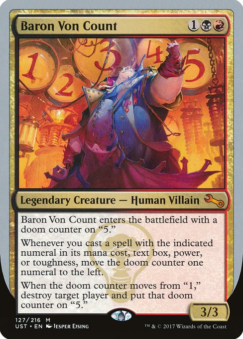
- Palette and mood: Deep blacks and crimson accents dominate the frame, signaling stealth and menace while keeping a Wagnerian flair of dramatic confrontation. The color balance is not just pretty; it nudges you toward risk-taking and decisive, sometimes reckless, moves.
- Character design: Baron Von Count’s silhouette—an aristocrat with a cape—reads as timeless villainy tempered by humor. The art’s satire lands through expressive posture and slightly exaggerated features, a wink that red and black blend into a signature vibe. 🧛♂️
- Symbolic punctuation: The League of Dastardly Doom watermark serves as a tiny, knowing punchline—color psychology in a card frame that’s part theater, part puzzle. It’s not just artwork; it’s a narrative device that nudges players to anticipate the next numeral twist.
- Numbers as narrative fuel: The mechanic’s numerals are color-agnostic on the surface, but the red-black energy surrounding the Baron makes every numeric reference feel like a shouted countdown. In a game where tempo often dictates outcomes, the artwork amplifies that suspense. 🕰️
Unstable’s silver-bordered, humorous aura cleanses the tension with a smile, yet the color psychology behind Baron Von Count remains serious in its intent: to evoke that quintessential vampire equation—charisma, danger, and a clock that’s always ticking. The art and the text work in tandem to remind players that even a silly, borderless set can deliver genuine emotional leverage through color storytelling. 🎨
From canvas to table: how the card’s mechanics echo the mood
The card’s text instructs that Baron enters the battlefield with a doom counter on “5.” Each time you cast a spell with the indicated numeral in its mana cost, text box, power, or toughness, the doom counter shifts one numeral to the left. When the counter leaves “1,” a target player is destroyed and the doom counter moves to “5.” This is not merely a math exercise; it’s a narrative engine. The black-red mana cost of {1}{B}{R} anchors Baron in a space where calculation and aggression intersect. The power and toughness sit at 3/3, a sturdy but not-unassailable frame for the drama—the vampire-lord who doesn’t need a hoard of gold when he can count down your turns with a sly grin. 🧙♂️⚔️
In practice, Baron Von Count is a novelty that rewards attentive play and a taste for the theatrical. The red-black pairing thrives on tempo: you lean into quick, decisive plays to propel the doom counter left, while the black side looks for disruption and the satisfaction of inevitability when the counter finally hits the pivotal moment. For players drawn to art-forward decks or humorous, rules-savvy builds, Baron offers a playful but pointed reminder: numbers—whether in mana costs, card text, or the creature’s own body—can be as narrative as any spell’s lore. 🧩
Art, lore, and collector’s charm
Jesper Ejsing’s illustration for Baron Von Count captures a mischievous elegance that fits Unstable’s tonal blend of humor and cunning. The silver border marks its Un-set status, while the warrior-poised villain and the shimmering doom symbol anchor the piece in a mythic lineage that fans adore. The watermark and the card’s rarity—mythic—underscore its collector appeal, as does its ability to exist in foil alongside nonfoil variants. For collectors who chase the glamour of “rare in a funny set,” Baron is a delightful mix of nostalgia and novelty. The art, the theme, and the mechanics converge to give players something that feels unique in every reprint or casual gathering. 💎
Meanwhile, Unstable’s playful spirit invites conversations about how color influences perception in card design. If red conjures speed and theatrics, and black conjures inevitability, then Baron Von Count becomes a charming ambassador for that dialogue. In a hobby built on deep strategy and intricate flavor, this card reminds us to savor the moment when art, color, and rules weave a tiny story on your playmat. 🧙♂️🎲
Connecting with a broader ecosystem
As a cross-promotional note, the new Rugged Phone Case — an option for those who like to keep their gear safe during long weekend tournaments or casual Friday night leagues — sits nicely alongside this kind of MTG reflection. If you’re transporting your deck and your poster art print alike, a sturdy case helps protect the mood as much as the cards. For fans who love a touch of design-forward practicality, the product page is worth a quick browse. The future of MTG discourse isn’t just about the cards on the battlefield; it’s about the way we carry, preserve, and celebrate the culture that makes these stories come alive. 🔥🎨
Rugged Phone Case — Impact Resistant Glossy PolycarbonateMore from our network
- https://crypto-acolytes.xyz/blog/post/europa-universalis-iv-vs-hearts-of-iron-iv-which-strategy-wins/
- https://crypto-acolytes.xyz/blog/post/crypto-farming-in-games-how-to-earn-while-playing/
- https://crypto-acolytes.xyz/blog/post/how-to-build-a-wool-farm-in-minecraft/
- https://crypto-acolytes.xyz/blog/post/rare-biomes-in-minecraft-explained-a-quick-guide/
- https://blog.rusty-articles.xyz/blog/post/blazing-blue-giant-in-corona-australis-illuminates-the-milky-way/