Image courtesy of Scryfall.com
Symbolism in Rejuvenating Springs' Background Imagery
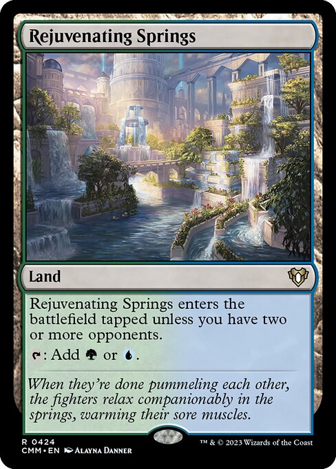
Magic: The Gathering has always rewarded a close look at what lies beyond the numbers on a card. Rejuvenating Springs, a land from Commander Masters, invites us to peek at the background as much as the foreground. The art, crafted by Alayna Danner, places two weary combatants in a warm, inviting spring, the kind of oasis that promises renewal after the clash of blades and wits. The scene isn’t merely pretty; it’s a visual poem about how conflict can give way to restoration, and how nature itself can mediate the tensions of a multiplayer table 🧙♂️🔥💎.
In the palette and composition, green and blue – the lifeblood of G and U in the color pie – lean into a narrative of growth and intellect. The pool’s steam shimmers with emerald light, while the surrounding flora suggests a careful, almost patient design. The background imagery stands as a counterpoint to the immediate drama of a duel: healing waters after the storm, a reminder that every spell and swing has a downstream effect on the plane’s ecology and the people who inhabit it. This is not a battlefield frozen in time; it’s a sanctuary where reflection, strategy, and camaraderie begin to mingle with mana and memory 🎲🎨.
Visual language: color, composition, and craft
The land’s aura leans into warm, welcoming greens and cool teals, signaling that this isn’t a simple fetch or splash of color. It’s a design choice that communicates reconciliation as a tactical and thematic possibility. The composition grounds the eye on the spring’s surface, then guides it outward toward the figures and their surroundings, hinting that healing is a shared journey rather than an individual victory. Even the steam—almost like delicate sigils rising from the water—feels symbolic: ideas, memories, and strategies rising to the surface after a moment of rest. It’s a small, quiet masterclass in how background imagery can reinforce a card’s ethos without shouting it from the page 🧙♂️.
“When they’re done pummeling each other, the fighters relax companionably in the springs, warming their sore muscles.”
The flavor text anchors the moment in a social, narrative space. It suggests that combat can be fierce, but it also forges bonds that outlive a single match. That underlying message resonates with the multiplayer-heavy ecosystem of Commander Masters, where cooperation and politics shape the tempo of the game as much as any spell or creature. The art’s quiet, almost domestic intimacy—two people sharing warmth after the clash—serves as a visual metaphor for the card’s multiplayer-friendly nature and its green-blue identity that values growth and knowledge over pure aggression 🔥🎲.
Multiplayer dynamics and the land’s enter-tapped nuance
Rejuvenating Springs enters the battlefield tapped unless you have two or more opponents, a mechanic that is as much about table politics as it is about mana efficiency. This gating aligns with the scene’s theme: healing and renewal are most meaningful when the circle is larger. In a 3, 4, or 5-player game, the land becomes a reliable source of {G} or {U} mana, enabling you to ramp into blue or green staples, ramp spells, or center-stage countermagic and card draw. The art’s communal vibes echo this: when more minds are at the table, the Springs’ restorative power—represented by the dual green-blue identity—has the strongest impact. It’s a gentle nudge that sometimes the best play is not a swing for the fences, but a calculated moment of reset that keeps everyone in the game and the story moving forward ⚔️🎨.
Art, lore, and the design philosophy behind a rare gem
Alayna Danner’s illustration isn’t just a pretty landscape; it’s a design syllable that reinforces Rejuvenating Springs’ place in Commander Masters as a rare, color-mixing land that rewards social play. The card’s frame (2015-era black border) and the detailed illustration reflect Wizards of the Coast’s ongoing commitment to storytelling through artifact-level art and flavorful, world-building touches. The flavor text, while succinct, invites fans to imagine a wider world where after-hours conversations, strategic debates, and shared victories define a moment as much as the next draw step. If you love the idea that mana is more than a resource—that it’s a narrative thread tying players together—this card is a microcosm of that philosophy 🌎🧙♂️.
Collector insights: rarity, value, and what makes this land special
In the collector ecosystem, Rejuvenating Springs sits at the intersection of playability and prestige. Its rarity is rare, with a robust presence in both foil and non-foil printings. The Commander Masters set, known for its rich slate of reprints and iconic commanders, gives this land a place on many EDH decks that love splashy blue-green strategies. Market data from Scryfall places it around a few dollars in non-foil form and a modest premium for foils, reflecting its desirability among players who prize the card’s utility and thematic depth. Beyond price, the card’s art and flavor contribute to its appeal as a centerpiece in a multicolor, multiplayer deck that values resilience and diplomacy as much as raw power 🧩💎.
- Mana identity: Green and Blue (G/U) synergy that supports ramp, card draw, and counterplay.
- Strategic niche: Enters tapped in most 1v1 games but shines in multiplayer, encouraging political play.
- Artwork and print: Alayna Danner’s illustration, 2015 frame, black border, rare status in Commander Masters.
- Flavor and lore: The spring as a setting for camaraderie after conflict, echoed by the flavor text.
As you curate your next Commander table or casual Cube draft, Rejuvenating Springs invites you to consider not just what your mana does, but how your tabletop world breathes after the storm. The imagery asks us to value the moments of rest, the conversations around the water, and the shared understanding that renewal is a process—one that can begin with a tapped land and end with a flourishing turn that changes the course of the game 🧙♂️🔥.